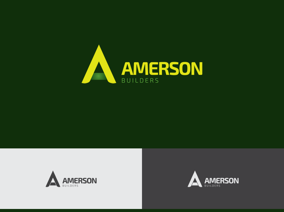
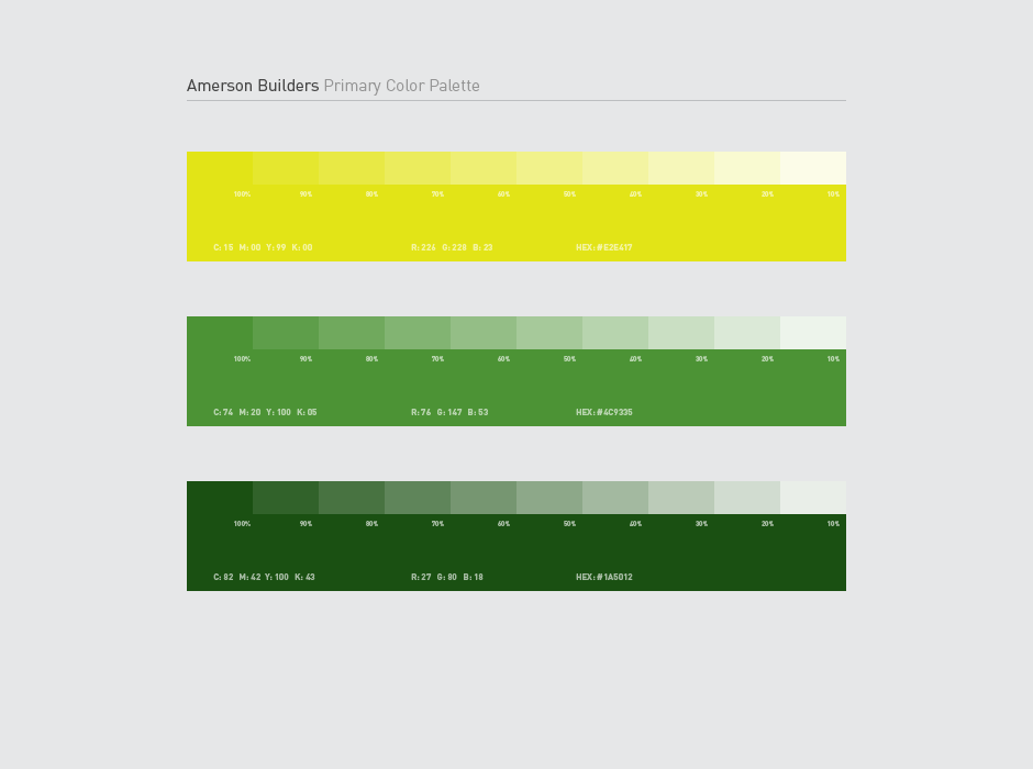
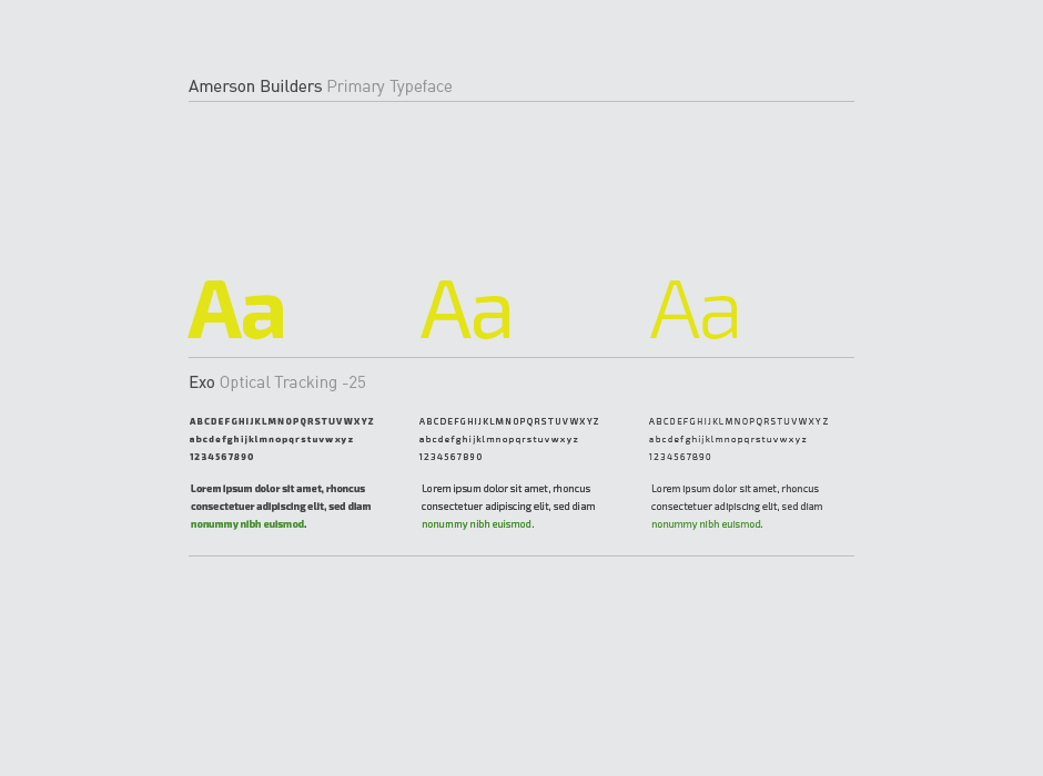
Amerson Builders Logo
Amerson Builders is a construction, renovation and landscaping business that prides itself in customer service and quality work.
Amerson Builders cover a wide variety of construction and landscaping services to meet its customer's needs. Their previous logo had been in use for a long time and looked like it had existed for even longer. The business decided to refresh its logo and asked me to help. The previous logo used an A as its main mark and they wanted to keep this in some form for the new logo. They didn't want their customers to lose the connection to the company.
The mark I created for them is both rigid an smooth. A building theme was used by making the A formed from two seperate parts constructed together. Also the main portion of the A works as a stylized roof for a home and the horizontal area represents the home's lawn. Both of these point to Amerson Builders' area of work and move the original goal of just keeping an A as a mark to a more meaningful and impactful identity.


