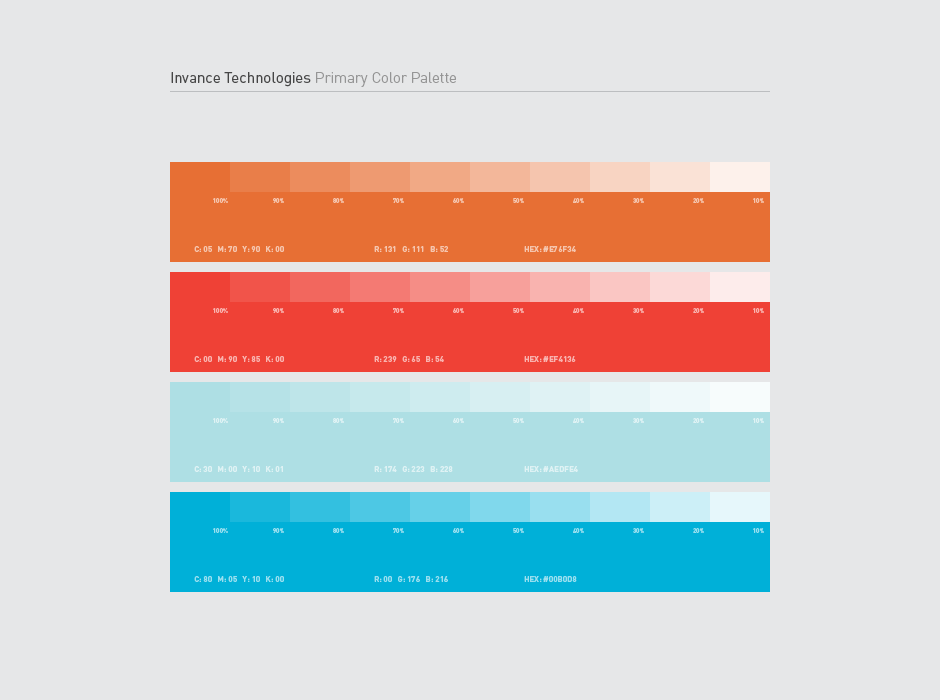
Invance Technologies Logo
Invance Technologies is a new start-up looking to provide IT services to local businesses in their area.
I was asked to come up with a logo design that would kick off the new business. IT wanted a logo that would feel "techy" but not contain "swooshes and swoops or circuit boards".
They were looking to take on clients long-term and continue providing services to them while building a solid network. The idea was to create something that represents progress contained in one central location.