The Lucky 13 Rack Card
Shannon Scott has been a celebrated storyteller since 1988 and provides a series of acclaimed tours in Savannah.
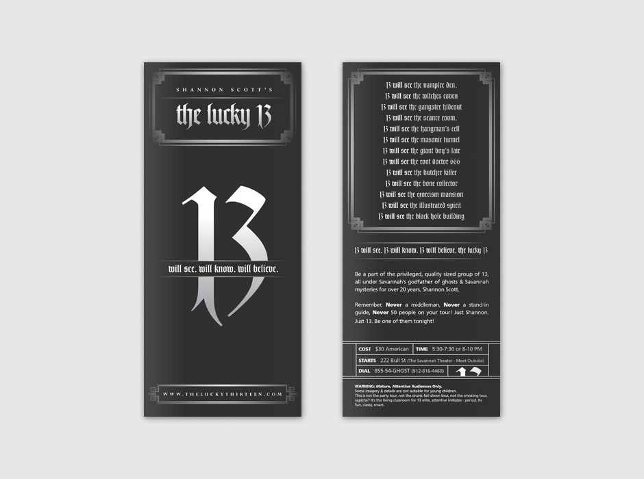
Shannon came to me looking to redesign the promotional pieces he uses for one of his paranormal tours, The Lucky 13. The card he was currently working with had trouble standing out in the various locations it was used. The best way to make sure his advertisement stood out from the pack was to be different. Instead of screaming with colors and photography, The Lucky 13 would stay dark, enigmatic and elegant.
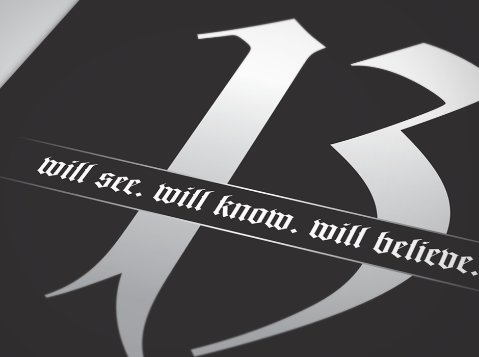
Shannon and I wanted to avoid "ghostly" cliches and trends that had cropped up in recent years. A cryptic and mysterious theme of the "unknown" was used to both provide the visual draw and to set the tone of the tour itself.
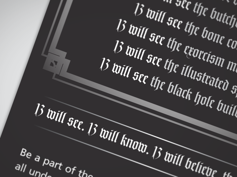
The communication was kept fully simple and effective by having most of the visuals in the actual copy itself.